Friends,
My blog has moved over to the same address as my website: www.mazalart.com
The blog is found at http://mazalart.com/blog-2/
I look forward to meeting you there!
Chanan
Sunday, October 05, 2014
Sunday, May 19, 2013

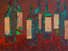
Ongepatchket | אָנגעפאטשקעט | נקוד וטלוא
Jerusalem Theatre Gallery, till June 11, 2013
When Jacob negotiated with his nasty father-in-law Laban, he chose the decorative spotted and patched sheep and goats as salary. He left those with Minimalist aesthetics for his in-laws. Indeed, Jacob showed talent at encouraging the flock to reproduce with even more resplendent patches.
Following our forefather’s example, I explore the world of pattern and ornament, as a vehicle of artistic, emotional and ideological expression.
I had my first encounter with patchwork when my Mom gave me some old wallpaper catalogs. My scissors and glue had always worked overtime, but the mess was more than she expected. In desperation, she cried, “Stop patchkying around!”
Patchkerei: Yiddish for making a big fuss with lots of details. From Old German patch.
Mom often dragged me to antique shops valuing my 8 year old opinion. Victorian treasures and monstrosities could still be purchased for pennies. If something was particularly dripping with poorly applied ornament, we would laugh,
“It’s sooooo ongepatchket!”
Ongepatchket: Yiddish, over decorated, fussy.
So how do all of these stories “patch” together?
I am an artist creating HERE - in our noisy, colorful, intimate, dressed-in-schmattes Holy Land.
I often work by layer upon layer of patterned patches; ripping and unraveling the image, then gently “sewing” it together. I like paintings with something missing, spontaneous, with a turbulent undercurrent, yet somehow full of joy.
Monday, February 20, 2012

I would like to share some of my recent artwork with you.
Last May, at the opening of my show at the Jerusalem Theatre, I spoke about the border between ornament and art, and about my exploration of ornament's potential as a vehicle for emotional and artistic expression. I have found this subject to be even deeper and more gratifying than I had imagined. While applying more and more layers to each painting, I alternatively create denser layers of pattern, or masks to hide or mutate them. Like a toddler building a tower of blocks, building, knocking down, and building again. At the same time, my own levels of raw emotions vacillate with a desire to return to a well behaved and pretty aesthetic. Like the naughty child in Sendak's "Where the Wild Things Are".

My goal is to stop working at that enigmatic point in time, when I feel that this tug of war, has reached a perfect tie: The war is between impulsive, yet engaging "bad taste" and refined, pleasing "good taste". The moment when our tense concentration, breaks into a humorous, joyous smile.

I use the power or delicacy of pattern, to counterbalance my deliberately coarse executed of earlier layers; to correct my deliberately imperfect compositions, and to make peace with waring colors. I prefer to initially attack the canvas as quickly as possible, from my gut. Then I patiently, thoughtfully and joyfully, build up the painting to that moment of equilibrium. Perhaps we all get gratification from fixing broken things.

When artists paint portraits of others, in a sense they are always painting themselves. Likewise, I feel that even when painting the most neutral of objects, these works reflect my own search for self identity. Our teenage self definitions get redefined over time, as we mature, change our family and work roles, and re clarify our values.
I find that self humor is a great tool. Perhaps that is why so many of my works contain either a well balanced, symmetrically placed
object, over a joyfully chaotic undercoat, or impossibly off balanced bowls, about to roll off of the canvas.
If any of you folks are here in Jerusalem, please join me at the opening of my newest exhibition:
Tuesday Feb. 20 2012, from 6 - 9 pm
at the AACI Center, 2 Poalei Zedek St. corner of Pierre Koenig, 4th floor. (across from the Hadar Mall in Talpiot)

Tuesday, October 11, 2011

Thursday, June 09, 2011

On June 24 I will be opening a show of my recent works. The title reflects my fascination with surface tension in painting: Painting was by definition 2 dimensional, but in reality, it is anything but that: Paint has body. Paper and canvas have texture, little mountains and crevices. And all patterns and repetitions indicate movement.
I will plagiarize a lovely comment on my Facebook page, that expresses my goal:
"Your works are so vibrant and somehow contain movement in each, I don't know if I 'look' at your paintings as much as 'watch. Very aptly named show." (Thanks Ruth)
If you are in Jerusalem, please come by!
Wednesday, March 02, 2011

Sunday, November 28, 2010
Subscribe to:
Posts (Atom)
